Microsoft-CALM (Compass Asset and Lifecycle Management)

Role
UX/UI Designer
Timeline
4 years
Tools
Figma, FigJam, Notion, Jira
Client
Microsoft & Compass Group
My Role
My work covered the entire design process — from research to delivery.
I researched existing asset management tools to identify UX best practices, then applied those findings to the product. I built the design system on top of Microsoft's existing branding, ensuring visual consistency across every screen. I followed WCAG accessibility standards throughout, and designed responsive layouts that work across desktop, tablet, and mobile.
Every screen in CALM — from the asset registry to the workflow builder — was designed by me, translating complex business requirements into a clean, usable interface.
The Problem
Every team tracked their assets. Nobody tracked what happened between teams.
Microsoft and Compass employees weren't careless. They had spreadsheets, processes, and people responsible for keeping things updated. But when an asset moved from one team to another — that journey lived nowhere. Teams managed assets independently with no unified record, and approvals got stuck in email threads with no clear owner or resolution.
What Made This Hard
Different people needed to see completely different things
An admin overseeing the whole system needs to see everything — every device, every person, every status change. A regular employee just needs to know what's assigned to them. The challenge was building one platform that felt purposeful for both.
Too much information on screen — and none of it could be missed
Teams were managing hundreds of assets across email threads and spreadsheets — tracking statuses, locations, and assignments all separately. Moving that into one screen meant a lot of information had to be readable at a glance. We built a flexible table — filterable by columns, exportable — so each person could surface what mattered to them without getting lost in the noise.
Multiple teams, multiple ways of doing the same thing
Each team had its own process for requesting, approving, and receiving equipment. Designing a system flexible enough to handle all of that — without making it feel like several systems stitched together — was the hardest design problem in the project.
Design Decision — Configurable Workflows
Every line of business had its own way of requesting and approving assets. A phone request at Microsoft AT&T went through different people than a laptop request at Compass. A one-size-fits-all workflow would have broken immediately.
Before designing anything, we studied how each team actually worked — who approves what, in what order, and what gets skipped. The decision was to build a configurable workflow system: admins define their own approval flows per asset type, rather than forcing everyone into a fixed process.
The risk was building something too flexible — a tool so open-ended that teams wouldn't know how to use it. That tension between flexibility and usability drove most of the workflow builder decisions.
Key Screens
Asset Registry
The device list — where most people spend most of their time
Every device in the organization, searchable and filterable in seconds. Each row tells you what the device is, where it is in its life, and whether it needs attention — without opening it.
Lifecycle Approval Workflow
Every asset has a lifecycle. Every stage has a process.
Assets move through lease and warranty stages — active, up for renewal, expired, end of life. Each stage triggers its own approval workflow: IT Directors, Finance, Sourcing, and others notified in the right order. Steps can be skipped when the situation calls for it. No email chains, no chasing people down, no wondering where things stand.
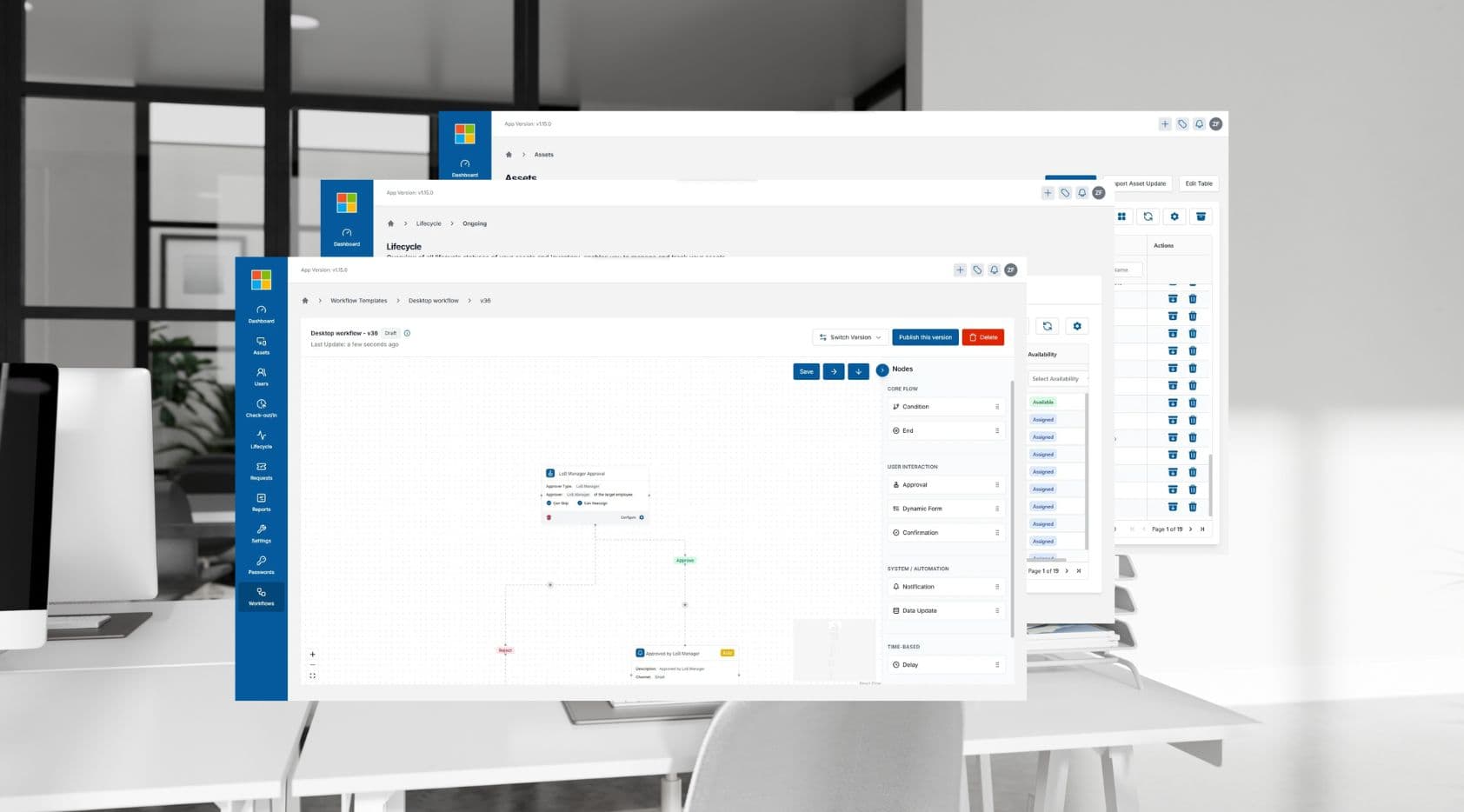
Workflow Builder
Building approval flows for each team
Each team had a different approval process. We built a visual tool that lets the right people configure their own flows — who approves what, in what order.
Outcomes
Before CALM, teams tracked assets independently with no shared record. After launch, every device had a single audit trail, approvals were handled in-app with automatic notifications, and both Microsoft and Compass worked from one unified view for the first time.
Learnings
Get the structure right before touching the visuals
The most important work happened before any screen was designed — agreeing on what statuses an asset could have, and what each one meant. That clarity made every downstream decision faster and cleaner.
Design for roles, not just user types
Different people in the system had different levels of access. An admin sees everything. A regular employee only sees what's assigned to them. Designing around what each role could actually do — not just what they needed — made every screen cleaner and more focused.
Consistency matters more than you think
When people use a platform every day, they build habits fast. Keeping interactions, labels, and patterns consistent across every screen wasn't just a design preference — it was essential for usability. Small inconsistencies add up to real frustration.
Next project
Microsoft-DISH