Microsoft-DISH (Dining Service Health Dashboard)
Role
UX/UI Designer
Timeline
2 years
Tools
Figma, FigJam
Client
Microsoft & Compass Group
Scale
Multiple locations
My Role
Embedded in a project where the data, the integrations, and the scope were all moving targets.
My work started with understanding how operations teams actually monitor equipment — what they look for, how fast they need to act, and what gets missed. From there, I designed the full product: the dashboard, the map view, the notification system, and every supporting screen. I built on Microsoft's existing branding and applied WCAG accessibility standards throughout.
What made this project different from a typical dashboard build was designing ahead of the data — the API wasn't finalized when design work began, which meant every decision had to hold up under uncertainty.
The Problem
Every cafe had someone responsible for their equipment. Nobody knew what was happening across all of them.
Microsoft and Compass employees weren't careless. They had people on the ground, processes in place, and teams responsible for keeping things running. But when an appliance went down in a cafe across the city — or across the country — that information lived nowhere central. Teams managed their equipment independently, with no shared view, and problems only surfaced when someone on the floor noticed and made a call. By then, the damage was already done.
What Made This Hard
Different people needed to see completely different things
An operations manager overseeing multiple buildings needs to see everything — every appliance, every location, every alert. A cafe employee just needs to know what's assigned to their site. The challenge was building one platform that felt purposeful for both, without overwhelming one group or under-serving the other.
Designing without the actual data
The API data from the client wasn't finalized when design work began. That meant making layout and display decisions — table structures, status indicators, alert formats — without knowing exactly what we'd be working with. Every design had to be flexible enough to absorb changes without breaking.
Working within third-party constraints
DISH relied on PowerBI for embedded reporting and Agilysys APIs for appliance data. Neither was fully in our control. The design had to match what those systems could actually output — not what would have been ideal — while still feeling like one coherent product.
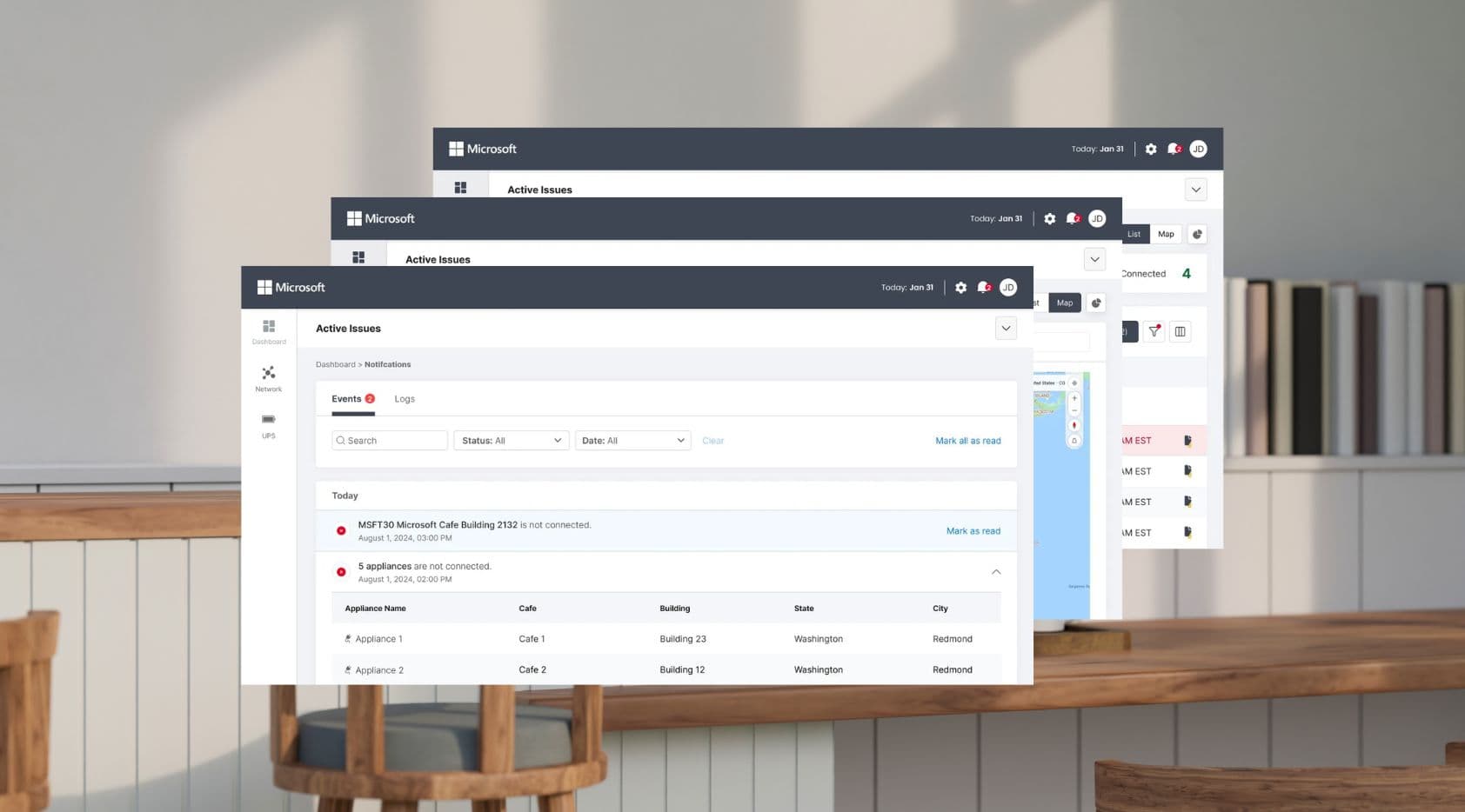
Design Decision — Real-Time Status at a Glance
Every appliance across every location had its own status, and that status could change at any moment. The risk of showing too much was that nothing would stand out. The risk of showing too little was that something critical would get missed.
Before designing anything, we mapped out what statuses an appliance could actually be in — online, offline, degraded, unknown — and what each one meant operationally. That clarity became the foundation for everything: color coding, alert priority, table filtering, and notification triggers.
The decision was to lead with status — make it the most prominent piece of information on every screen — and let users drill down from there. A manager scanning the dashboard shouldn't need to open a single record to know if something needs attention.
The tension was between showing everything and showing what matters. We resolved it by designing two layers: a high-level dashboard for monitoring, and a detail view for investigation.
Key Screens
Appliance Dashboard
The health overview — where operations teams start every shift
Every appliance across every location, visible at a glance. Status is front and center — online, offline, or degraded — so teams can spot problems without opening a single record. Filterable by location, building, city, and status.
Map View
See where problems are, not just what they are
A geographic view of all monitored locations, with status indicators overlaid on the map. When an appliance goes offline in a building across the city, the map makes the location obvious immediately — no searching through lists.
Notification Management
The right people, notified the right way
Alerts are delivered through in-app notifications, SMS, and email — configurable per user and per location. When an appliance goes down, the relevant team is notified automatically. No more waiting for a floor report.
Outcomes
Before DISH, teams found out about appliance failures when someone on the ground noticed and made a call. After launch, appliances across multiple locations — spanning cafes, buildings, and cities — had a single health record for the first time. Both Microsoft and Compass teams are automatically notified the moment something goes down, replacing a process that previously relied entirely on manual floor reports.
Learnings
Status clarity is the foundation of everything
Agreeing on what states an appliance could be in — and what each one actually meant — had to happen before any screen was touched. Without that shared definition, every design decision downstream would have been built on guesswork.
Ambiguity in the data is a design problem
When the API isn't finalized, the temptation is to wait. The better move is to design for the range of possibilities — what if this field is empty? What if the status is unknown? — so the interface holds up no matter what comes back. Designing for edge cases early saved significant rework later.
Constraints from third parties are design constraints too
Working with PowerBI and Agilysys APIs meant some decisions weren't ours to make. The data structure, the refresh rate, the output format — all of it shaped what was possible. Treating those constraints as design inputs early, rather than problems to solve later, made the final product feel more cohesive.
Next project
RoboBurger