Trustabl — AI Metadata for Agentic Tools
Role
UX/UI Designer
Timeline
Ongoing
Tools
Figma, FigJam
Client
Trustabl (Startup)
My Role
I joined Trustabl as a UX/UI Designer during the early product phase, working across research, user flows, and prototyping.
My work started with competitor analysis — studying how existing tools in the developer and agent ecosystem presented complex technical findings, and identifying where they fell short. From there, I mapped the end-to-end user flow, which turned out to be the most critical and most difficult part of the work. I then translated that flow into prototypes covering the core screens: sign in, repository import, repository overview, and the repository details page where users review findings and act on them.
Trustabl is still in development. There are no live users yet — but the design decisions made now directly shape how the product gets built.
The Problem
AI agents fail in production — not because developers are careless, but because the tools they build aren't hardened for real-world conditions.
Most AI tools are built quickly: schemas are incomplete, retry logic is missing, validation is skipped, and there's no visibility into what's actually happening at runtime. In a demo, this is invisible. In production, it compounds fast — wrong tool calls, silent failures, runaway token loops, and debugging nightmares with no clear starting point. 88% of AI agent pilots never make it to production. The dominant question from developers in 2026 isn't “how do I build an agent?” — it's “how do I make my agents stop breaking?”
The answer Trustabl is building: connect your GitHub repo, get an instant Production Readiness Score, and let the system generate the hardening fixes automatically.
What Made This Hard
A multi-state process that could easily lose users
A repository doesn't have one state — it moves through scanning, analysis, scoring, enrichment, review, and export. Each state looks different and demands different things from the user. The design challenge was making that progression feel clear and logical, not like a black box with random status changes.
Surfacing findings without triggering false-positive anxiety
If users see a long list of findings and distrust them, they disengage. The whole product collapses. Every finding had to feel earned — specific, actionable, and credible. Designing the findings view meant thinking carefully about what to show, how to prioritize it, and how to frame automated suggestions so users feel in control, not overwhelmed.
80–90% automation with a human still in the loop
Trustabl auto-generates most of the hardening metadata — validation rules, retry policies, observability hooks, applicability constraints. But users still review and approve. The UX had to make that handoff feel natural: here's what we did, here's why, here's what you need to decide. Not a wall of diffs, not a single accept-all button.
Design Decision — Mapping the Flow Before Touching the Screens
The user flow was the hardest design problem on the project — and the most important to get right before anything else.
A repository goes through multiple states: unscanned, scanning, scored, enriched, under review, exported. Within each state, the user has different information available and different decisions to make. Getting that wrong meant screens that felt disconnected or a process users couldn't follow.
Before any screen was designed, I mapped every state a repository could be in, what triggers the transition, and what the user needs to see and do at each point. That map became the foundation for every screen that followed.
The specific tension was between automation and control. Trustabl does most of the work automatically — but developers are the ones who have to trust the output and ship it. The flow had to respect that: show the work, explain the findings, let users approve or reject at their own pace. Not a fire-and-forget tool, and not a manual checklist either.
Key Screens
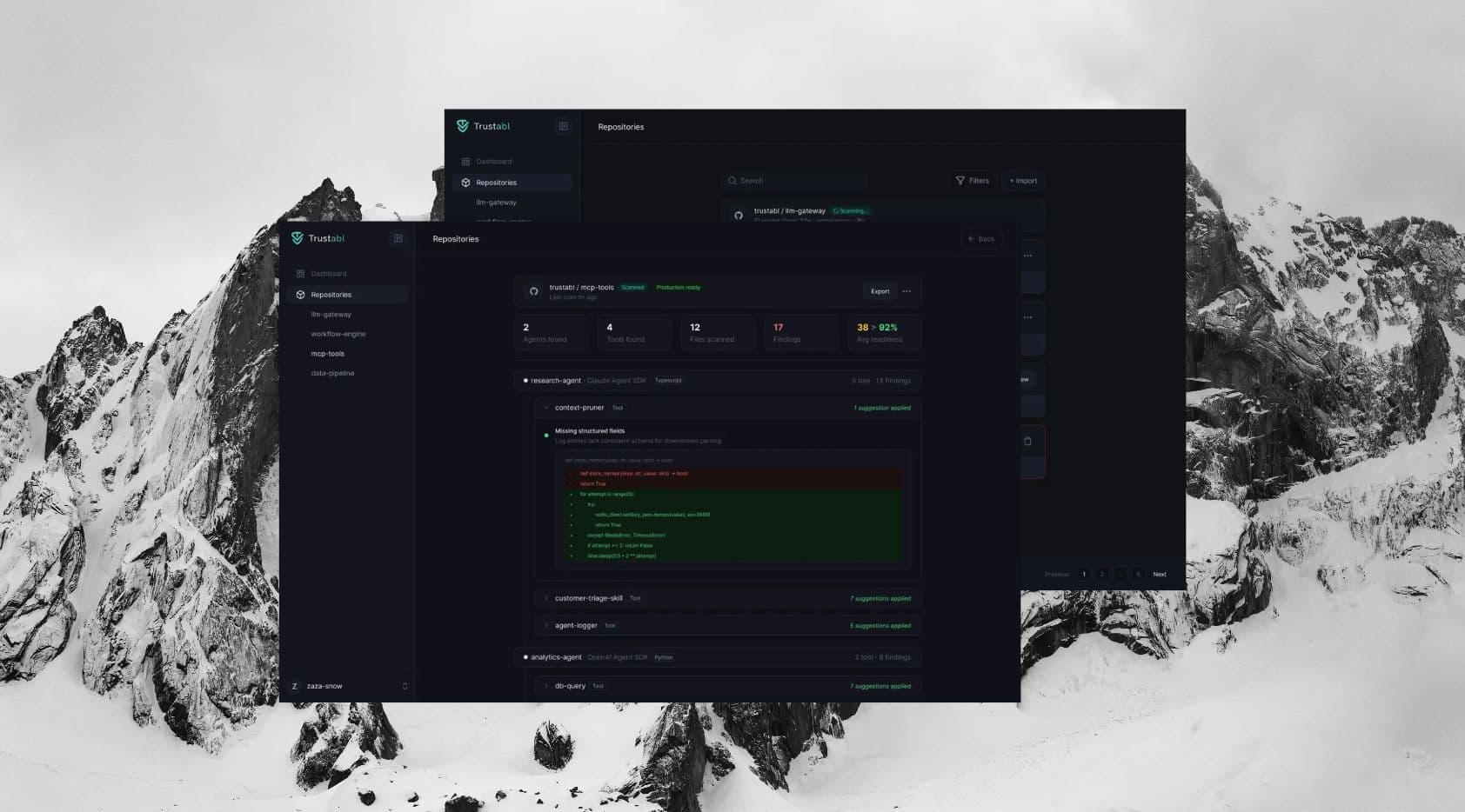
Repository Page
All your repos, their readiness at a glance
An overview of every connected repository with its Production Readiness Score front and center. Color-coded status — High Risk, Needs Hardening, Production Ready — so users can prioritize without opening a single detail view.
Repository Details Page
Where findings become decisions
The most complex screen in the product. Shows the full analysis: findings by severity, auto-generated fixes, expandable diffs, and approve/reject controls. Designed to surface the most critical issues first and give users enough context to act confidently — without drowning them in information.
Outcomes
Trustabl is still in development. There are no live users yet.
What exists is a validated flow, a working prototype, and a clear design foundation for the engineering team to build from. The decisions made in the design phase — how states are communicated, how findings are prioritized, how the approve/reject flow works — directly shape how the product gets built and how developers will experience it at launch.
Learnings
Map every state before designing any screen
A product like Trustabl has more states than are obvious at first. A repository isn't just 'scanned' or 'not scanned' — it's unscanned, scanning, scored, enriched, partially reviewed, fully reviewed, exported. Designing without that map leads to screens that don't connect. Getting the states right first made every screen faster and cleaner to design.
Credibility is a design problem
If users don't trust the findings, they won't act on them — and the product fails regardless of how accurate the analysis is. Designing the findings view meant thinking about how to present automated suggestions in a way that feels specific and earned, not generic. Prioritization, severity framing, and the ability to reject findings all contribute to whether users feel in control or skeptical.
Uncertainty doesn't pause design — it shapes it
With no live users and a product still being built, the features, APIs, and edge cases were all in flux. Rather than waiting for things to stabilize, the better approach was designing screens that could absorb change — flexible enough that a shift in the data model or feature scope didn't require starting over.
Next project
Carbonetes